Accessibility for Content Creators
How to make your web content accessible to people with disabilities
Updated 2/15/24
What is Web Accessibility?
Web accessibility means that websites, tools, and technologies are designed and developed so that people with disabilities can use them. – W3C
Why do we do it?
- To enable the roughly 24% of Americans living with disabilities equal access to website resources.
- Because it’s required by law: the Americans with Disabilities Act requires equal access to places of public accommodations, including websites.
- Good accessibility practices, such as using keywords in headings and supporting mobile device use, tend also to improve search engine optimization.
- Building an accessible website is beneficial even for users without disabilities: captioning on videos, for example, helps people in noisy places and non-native speakers consume video content.
- It’s a privacy issue: users with disabilities need to be able to get the information and complete transactions without asking for help.
- It’s far less expensive to build a website and create content with accessibility in mind than to settle an ADA complaint.
Content Structure & Heading Hierarchy
Website content, much like document content, is structured through the use of headings 1 through 6 and bulleted and numbered lists.
Why is content structure important?
- Users of some assistive technology rely on properly-tagged headings and lists to parse content.
- Properly nested, keyword-rich headings improve search engine rankings.
DO
- Use the built-in WordPress styles for headings and lists.
- Nest heading levels in order.
- Use descriptive, keyword-rich language in your headings.
- Use a unique Heading 1 for each page; otherwise, start with Heading 2.
- Use proper tags for bulleted and numbered lists.
DON’T
- Don’t skip a heading level in the hierarchy (i.e. go straight from a Heading 2 to a Heading 5, for example) for the sake of appearance.
- Don’t use large fonts and bold style to create false headings.
- Don’t use indents or special symbols to create false lists.
Links
Links include text links and buttons that are linked to other pages or to elsewhere on the same page. Images can also be links; see the following “Alternative Text for Images” section for more on that.
Why is crafting good text links important?
- Meaningful link text helps users decide which links to follow.
- Some users prefer to tab through links; for these users, making linked text meaningful out of context is helpful.
DO
- Make sure the destination or purpose is described by the linked text (i.e. “Learn more about our model” instead of just “Learn more.”).
- Write the linked text so that it’s understandable without relying on the surrounding content for context.
DON’T
- Don’t use text such as “more,” “read more,” “click here,” or “learn more.”
- Don’t use a URL as the linked text. A screen reader will read each individual character in a link when recognizable words are not present.
- Don’t overkill with multiple links all going to the same destination. For example, if a person’s name is linked to their bio, you don’t also need their image to be linked to the bio.
Alternative Text for Images
Alternative text (also called “alt text” and “alt attribute”) is the written description of an informational image.
Why is alt text important?
- It is used by some assistive technology to describe an image for users with visual disabilities.
- If an image fails to load, alt text is what appears instead.
- Alt text provides image descriptions for search engine crawlers, improving indexing and page ranking for image searches.
DO
- The alt text should describe the function or context of the image (for example, alt=”College of Pharmacy at University of Michigan” or alt=”Register for the Webinar”).
- If a decorative image is being used just for “flavor,” use an empty alt: alt=””
- If the image is a graph, pie chart, or some other representation of data, provide a visible text description along with the image, ideally in properly marked up tabular format.
- If an image is near text describing it (such as a person’s photo near where their name is present in visible text), use the empty alt=””
- Generally avoid images that contain words. If used, all the words in the image should be included in the alt text.
- Images used as links must have alt text that describes the link’s destination.
- Cap alt text at around 125 characters.
- Use proper grammar and punctuation in alt text. Many screen reader voices change to indicate ends of sentences, for example.
DON’T
- Don’t include “image of” or “photo of” or “headshot of” or “logo of”
- Don’t use the title attribute for alt text; put it in the alt attribute.
How to edit Alt text within WordPress
Upload the image to the media library by selecting Media, Add New:

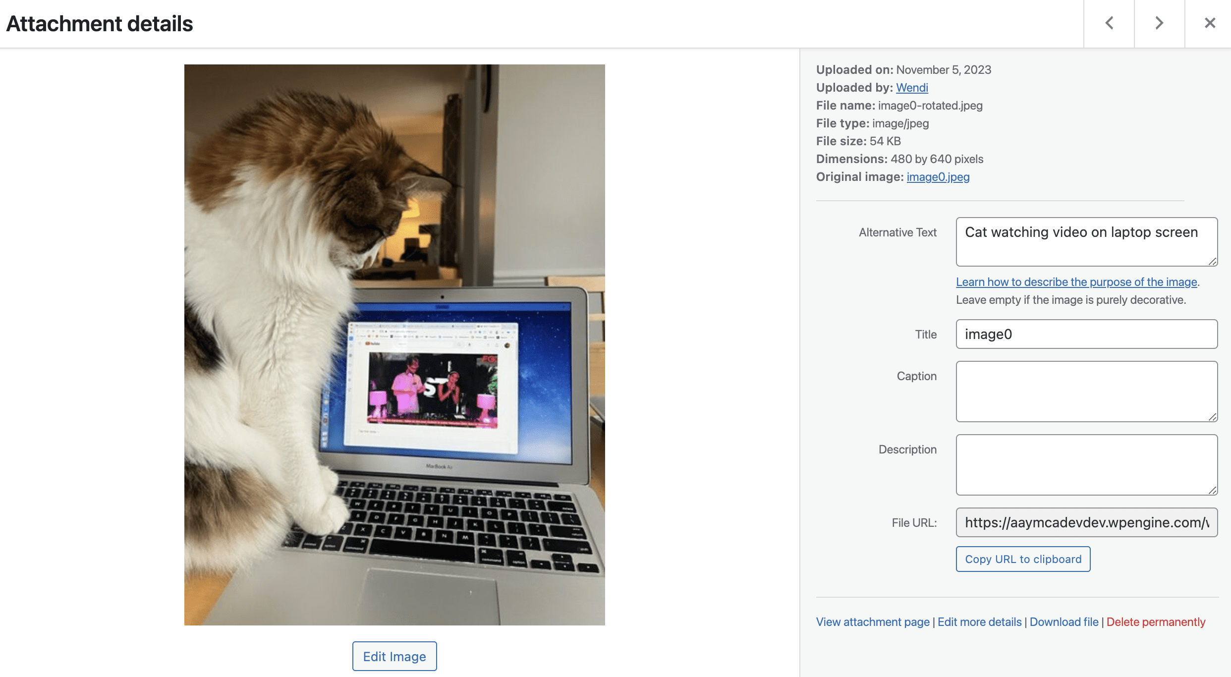
Once you have uploaded an image to the media library, select the image to get to its Attachment details. On that screen is a text field for alternative text:
Complex Images
Included in this group are bar charts, pie charts, line graphs, infographics, flowcharts, maps, and other complex images.
What is important to know about complex images?
Complex images offer particular accessibility challenges for people who are blind, low-vision, or colorblind; such graphics often rely on color to convey information, and on text that, because it is embedded in images, is not accessible to assistive technology.
DO
- Design your graphics to be understandable in grayscale.
- Provide graphical data in an alternative format, such as tabular.
DON’T
- Don’t omit details. Everything conveyed in a graphic must be presented in a text version too.
- Don’t rely on color alone to convey information.
Good
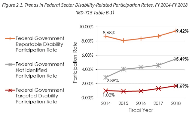
This EEOC graph uses symbols in addition to color so that it can be understood by people with color blindness:
Good
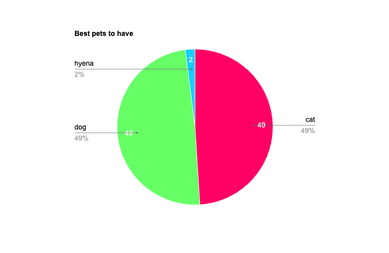
| Pet | Percent |
| cat | 49 |
| dog | 49 |
| hyena | 2 |
Bad
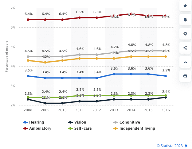
This graph will be very challenging to parse for users with certain types of color blindness:
Color Contrast
Color contrast, or more accurately, luminosity contrast, is a comparison of the brightness of the text and the brightness of the background color it sits on, expressed as a ratio.
Why are contrast considerations important?
- Millions of people in the United States have low vision. These users need high contrast between text and background in order to access website content.
- High contrast benefits people who are reading in bright light or outdoors.
When using a highly customizable page editor like the Divi Builder, it’s important to keep contrast in mind when setting background and text colors. In order to maintain WCAG 2.1 compliance, you need a color contrast ratio of 4.5:1 for body copy or 3:1 for larger headings (Source: W3.org). If you know the hexadecimal codes of your desired colors, you can use a tool such as WebAIM’s Contrast Checker to explore options ahead of time.
DO
- Abide by contrast-appropriate brand guidelines to maintain adequate contrast
- When choosing colors, make sure your combinations of text and background have high contrast, such as black on white or dark blue on light yellow.
- If you’re not sure whether your preferred color combination meets accessibility guidelines, consult with a designer or use a tool such as WebAIM’s Contrast Checker to confirm.
DON’T
- Don’t use color alone to convey meaning (i.e. links should not be just a different color but also underlined to convey they are links.)
- Don’t overlay text directly on background images. Provide a high-contrast background block of color between the text and image.
Examples
Good
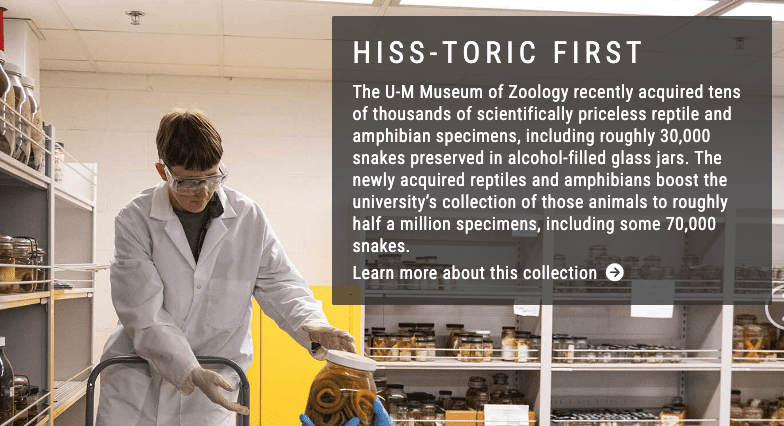
Bad
Video, Audio, & Multimedia Content
It is important to provide a text-based alternative to all media content that might otherwise rely on audio to communicate.
DO
- Provide a pause button for all moving or animated content (such as auto-advancing slide shows), if the motion lasts for more than five seconds.
- Provide closed captions and audio descriptions for multimedia content
- Provide transcripts for audio-only content
DON’T
- Don’t set anything containing audio content to start playing automatically on page load.
Downloadable Files
In addition to your website’s pages, linked content in downloadable files such as Word, PowerPoint, and PDF needs to be accessible too. Making files accessible is most easily done with the source file. For example, if your PDF’s source is a Word document, it’s easier to make the Word document accessible before saving as a PDF, than to remediate the PDF.
Why is it important to make sure your files are accessible?
When properly tagged, files can be accessed by assistive technology.
DO
- Use the program’s built-in styles for headings and lists.
- Add fully descriptive alt text for all meaningful images.
- Leave the alt field empty for unimportant and decorative images.
- At the document property level, add a page title and define the language.
- Run the file through the software’s built-in accessibility checker and remediate errors. (Note: for PDF accessibility, Acrobat Professional will be required.)
DON’T
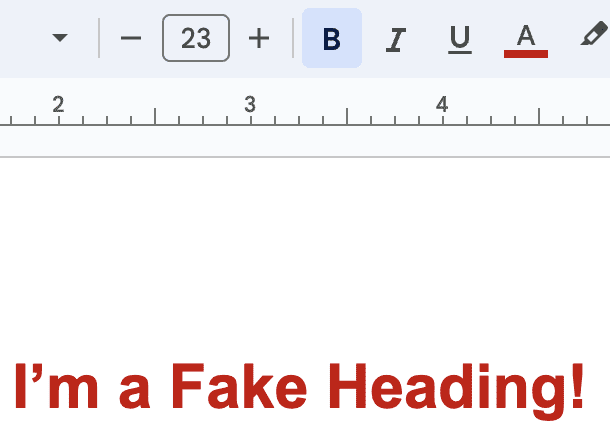
- Don’t create “fake” headings by adjusting font weight and size.
- Don’t create “fake” lists by using your own symbols for bullets.
Good
Bulleted list created using the bullet style button in Google Docs:
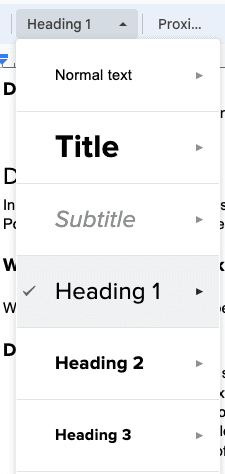
Good
Main heading defined by selecting the “Heading 1”
Bad
Heading defined using font size, weight, and color options in Google Docs:
Inclusive Language
In this context, inclusive language means using words that show that you recognize people have many different ways of understanding, experiencing, and interacting with your website.
DO
- Spell out acronyms the first time you use them on each page.
DON’T
- Don’t put acronyms in your main navigation unless they are very widely recognized.
- Don’t use directional words like “left” and “right” to describe the location of objects on the page; these directions are not meaningful to screen reader users, and they might be inaccurate in mobile layouts.
- Don’t use language that assumes mouse use. Many people do not use mice to move through a website.
